 Poster draft perth metropolitan (poster one)-1rgmrer
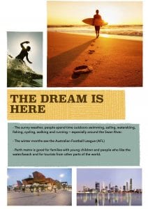
 Poster draft perth metro (draft 2)-1ee3mpe
Here are two more posters for you to consider. Please note the following comments:
Poster 1
- The images are well chosen but aren’t really linked. Better to have a series of posters which focus on a different aspect of the Perth Metropolitan Area than to be too broad and to cover too much within the scope of one text.
- The font for ‘Perth metropolitan area’ could be more imaginative. It’s not a particularly striking font.
- The pictures are a bit grainy- see if you can find higher resolution ones.
- Website link for more information?
- The text itself is quite general and you’d need to be a little more specific. What are the activities people can do while visiting?
- Some of the information is irrelevant for the purposes of the text.
- Needs to be more welcoming and more persuasive.
Poster 2
- I like the tagline of this poster better than the first poster. Why is this tagline more successful? Why is it more welcoming?
- The poster doesn’t state where the place you’re advertising is.
- Link to website?
- The text works more like an information text (the one above is similar) rather than persuading/encouraging people to visit.
- Why is Perth Metro ‘good for families’? You need to be more specific.
- The reference to sport (cricket and AFL) seem irrelevant.
- Promoting the good weather we enjoy here is a very good idea.
I think you need to focus on Perth as a place where the LIFESTYLE is really important… the quality of life we enjoy is very high indeed.
These posters are well designed and they’re clearly set out… but there’s some work to do in sharpening your ideas up a bit.