Task 1- Assessment Information- Submission Requirements

Please note the following submission requirements:

  • Your Task 1(a) and 1(b) are BOTH due on Friday 1st March.
  • Task 1(a) requires you to submit TWO tourism posters. ONE of the posters needs to be annotated in detail, explaining your choices of visual and written language.
  • Task 1(a) planning document- typed up. A copy of this is available to download from this class blog.
  • Task 1(b) requires you to submit a 2-3 minute oral recording which explains your reasons for choosing the particular visual and written elements of your tourism poster.

So… On Friday you will submit:

  1. Two tourism posters, one annotated in detail.
  2. Your planning document, typed up.
  3. Your oral recording.

As many of you are away on Thursday and Friday, I will accept the submission of your work via email as long as it is emailed to me by close of play on Friday. Any late submissions- without sufficient reasons– will incur a penalty. If you are able to, I will place a tray on the table in my office for you to submit your work.

On your return to school next week, I will expect you to submit the physical copies of your work as soon as possible.

Please come and find me if you need to ask any questions.

Print Adverts Promoting Australia

Print Adverts Promoting Australia copy-v5qtxv


Above is a link to a range of print advertisements which promote Australia in specific ways to specific audiences.


in today’s lesson, we looked at the following picture:

We explored the following things about this image:

  • The woman is in the centre of the image, and she is the first thing that we see. The first thing we notice on an image is called the FOCALISER.
  • She is tanned, toned, happy, she appears to be fit and she presents a positive image of Australia as a place where people enjoy the outdoor life in a healthy manner.
  • She is carrying a surfboard which is stereotypically Australian and this associates her strongly with the country.
  • The word ‘Australia’ is in the colours of the sun, which suggests that in Australia, the sun always shines.
  • She’s standing on a semi-deserted beach which is unspoilt. The sand is beautiful and the waves crashing onto it suggests Australia is a paradise inhabited by beautiful people who enjoy the outdoor life.
  • This is reinforced by the cloudless blue sky and the beautiful ranges in the distance.
  • ‘Just 21hrs away’ suggests that while Australia is far away, it isn’t isolated and you can get there in less than a day. It suggests that Australia is accessible.


Look at the other posters and see if you can make similar observations about them. How has colour been used? What is the focaliser? What do the images say about Australia? How do the words encourage or persuade us?


Also use the posters to assess your own posters and use them to work on your final drafts. How can you improve your own posters based on the ones attached to this blog post? What can you learn from these posters to improve your own?

Task 1- Assessment Information, Guidance and Task Sheets


Please see the attached documents for further information:

Task 1A Task 1a 2019-t29ytr

Task 1B TASK 1b- Tourism Posters (1) (1)-1rax2xr Task 1b) 2019-1q5yiu9

Task 1B Scaffold Scaffold for Task 1b (1)-v7cgmk

If you lose your copies of these sheets, either see Mr Jakeway in the English Office or download them from here and print them out.


What you need to do:

  • Produce a FINAL copy of your tourism posters, which include a logo, a slogan, images and written language which promotes your chosen region in a positive way.
  • You will need to produce an annotated copy of ONE of your posters. A PowerPoint on how to annotate images can be found here: IMAGE ANNOTATION – How to Annotate an image effectively (1)-20ljcfd
  • Once you have completed the scaffold document in note form, you can download the sheet here and type up the final version for submission.
  • Plan and produce a 2-3 minute oral recording (can be a video) which summarises your poster, explaining your reasons for designing your poster in a particular way. If you choose to produce a video, you can have images which you then talk-over to make your video visually appealing. It can just be a sound recording.

Please pay close attention to the marking key/assessment rubrics in the attached documents. Make sure you see Mr Jakeway if you have any questions.

AIDA- Marketing and Advertising Model

This is worth reading and exploring. We’ll look more closely at this next week.


AIDA is an acronym that stands for Attention, Interest, Desire and Action.

The AIDA model is widely used in marketing and advertising to describe the steps or stages that occur from the time when a consumer first becomes aware of a product or brand through to when the consumer trials a product or makes a purchase decision. Given that many consumers become aware of brands via advertising or marketing communications, the AIDA model helps to explain how an advertisement or marketing communications message engages and involves consumers in brand choice. In essence, the AIDA model proposes that advertising messages need to accomplish a number of tasks in order to move the consumer through a series of sequential steps from brand awareness through to action (purchase and consumption).


The steps proposed by the AIDA model are as follows:

  • Attention – The consumer becomes aware of a category, product or brand (usually through advertising)
  • Interest – The consumer becomes interested by learning about brand benefits & how the brand fits with lifestyle
  • Desire – The consumer develops a favourable disposition towards the brand
  • Action – The consumer forms a purchase intention, shops around, engages in trial or makes a purchase


Stage I. Secure Attention.

Stage II. Hold attention Through Interest.

Stage III. Arouse Desire.

Stage IV. Create Confidence and Belief.

Stage V. Secure Decision and Action.

Stage VI. Create Satisfaction.

More Sample Posters- Student Produced

Poster draft perth metropolitan (poster one)-1rgmrer


Poster draft perth metro (draft 2)-1ee3mpe


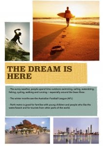
Here are two more posters for you to consider. Please note the following comments:


Poster 1

  • The images are well chosen but aren’t really linked. Better to have a series of posters which focus on a different aspect of the Perth Metropolitan Area than to be too broad and to cover too much within the scope of one text.
  • The font for ‘Perth metropolitan area’ could be more imaginative. It’s not a particularly striking font.
  • The pictures are a bit grainy- see if you can find higher resolution ones.
  • Website link for more information?
  • The text itself is quite general and you’d need to be a little more specific. What are the activities people can do while visiting?
  • Some of the information is irrelevant for the purposes of the text.
  • Needs to be more welcoming and more persuasive.


Poster 2

  • I like the tagline of this poster better than the first poster. Why is this tagline more successful? Why is it more welcoming?
  • The poster doesn’t state where the place you’re advertising is.
  • Link to website?
  • The text works more like an information text (the one above is similar) rather than persuading/encouraging people to visit.
  • Why is Perth Metro ‘good for families’? You need to be more specific.
  • The reference to sport (cricket and AFL) seem irrelevant.
  • Promoting the good weather we enjoy here is a very good idea.

I think you need to focus on Perth as a place where the LIFESTYLE is really important… the quality of life we enjoy is very high indeed.

These posters are well designed and they’re clearly set out… but there’s some work to do in sharpening your ideas up a bit.

Sample Posters- Student Produced

AS – BROOME POST 2-1zju3jx

AS-BROOME POST 1-s68ocr


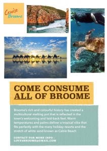
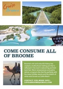
Here are some sample posters, which promote Broome as tourist destination.

It’s important here to note:


  • The tagline ‘Come consume all of Broome’ works as an advertising campaign tagline. It’s short and memorable and uses rhyme (‘Broome’ and ‘consume’) to make it catchy and easy to remember.
  • Maybe the casual reader would associate ‘consume’ with the reputation Broome has for a distinctive cuisine. It’s Asian-influenced food is noted as being spectacular. So… it’s possible to say that the images and the tagline don’t quite fit together at this stage.
  • Make sure that your tagline and images reinforce each other.
  • The text at the bottom is engaging, enthusiastic and well written. It uses alliteration, metaphor, informal language (‘vibe’) but gets a bit too general towards the end.
  • Note that there’s an email address. I would’ve gone with a website address as well as the email.
  • Both posters use the same design and the same logo ‘Cruise Broome’ which creates unity.
  • The word ‘All’ suggests that there’s a lot to see in Broome and works as a persuasive device here.


Use these notes as a guide for the production of your own posters. Remember that the expectation is for you to produce a minimum of two posters (and a maximum of three) by Thursday’s lesson.

Just Another Day in WA

Please watch the video (above). While we watched this in class, this is a really useful video because it has some useful advice on how you might be put an advertising campaign together.

Things to think about include:

  • What are going to be your main images which define your advertising campaign? What image is going to get people’s attention and how?
  • Who are you pitching your advertising campaign to? Who are you trying to attract to WA?
  • What words will you use to help persuade/encourage/inspire people to visit WA?
  • Can you come up with a memorable tagline (like ‘Another Day in WA’) that people can remember?

You’ll need to keep doing your research and we’ll start putting our advertising campaigns together this week. Remember to keep looking through the other links I sent you to help get ideas.

Welcome to Year 11 General

First of all, welcome to Year 11 and welcome to Year 11 General. This blog has been designed to help you through the course, to guide you through the material we will cover throughout the year and to give you a framework from which to work, particularly when it comes to preparing for assessments.

This is particularly important when you are absent from school, on VET, or for whatever purpose. This blog is mobile-friendly and can be accessed on any platform so please make sure that you subscribe to the blog at the bottom of the page. That way, you’ll receive email notifications whenever the blog is updated.

Remember that you can suggest material for this blog as it is YOUR blog… or OUR blog… It’s not just MY blog.